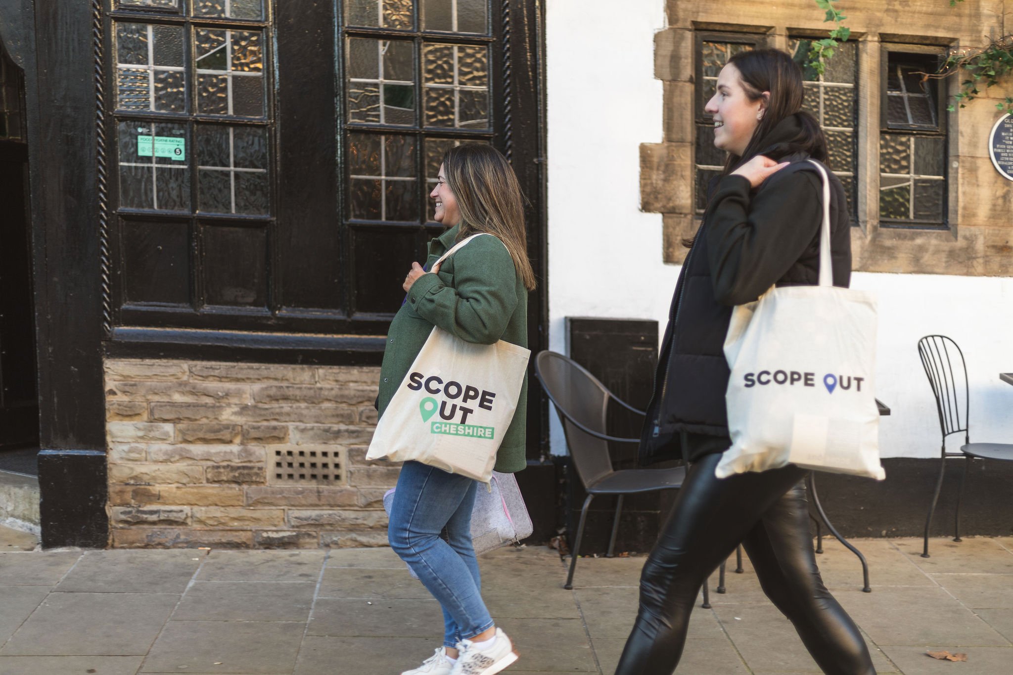
Scoping out a bold identity for a local business directory.
CLIENT: SCOPE OUT
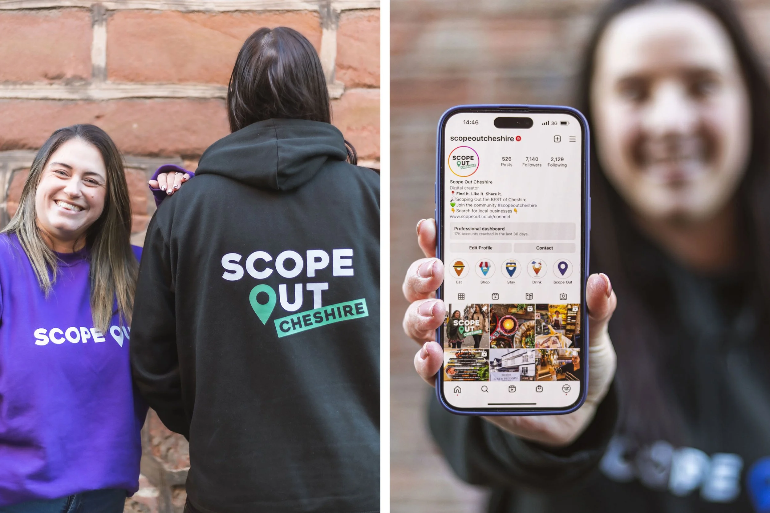
Scope Out thrive on helping local businesses stand out by creating digital content to increase engagement and boost visibility, all achieved by using their established online platform. Ran by two incredible business women, Jenny and Amanda, who came to me for help in creating new versatile branding, as the company would need to work regionally, the first being Scope Out Cheshire.
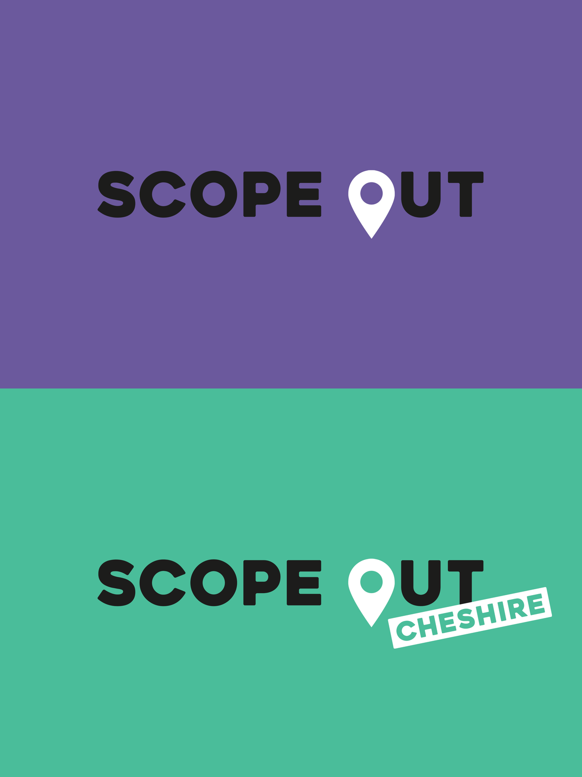
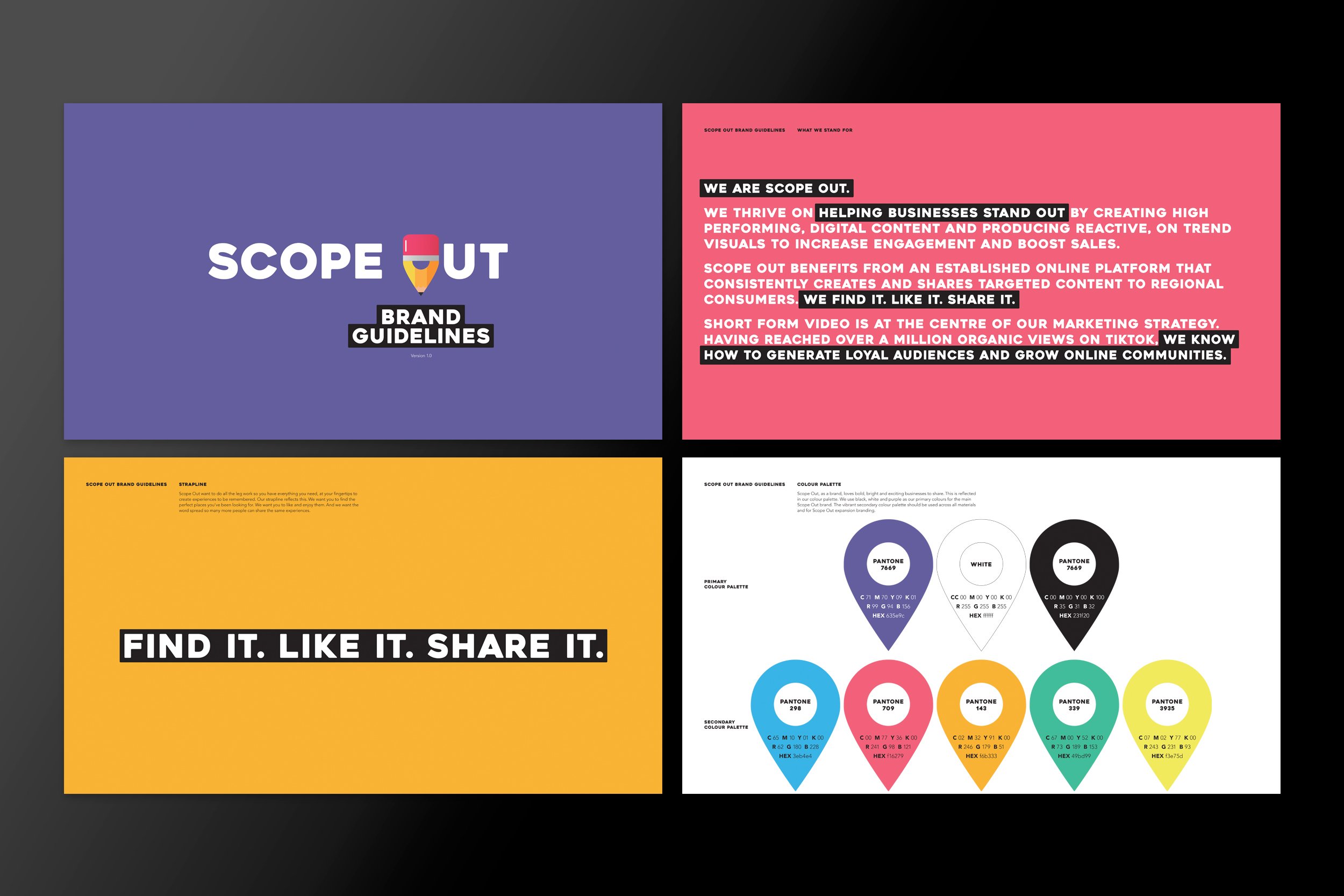
A logo design was created using a location pin icon and used bold colours to accompany a black or white basis to differentiate between regions. Allowing the company expansion when needed in the future. The Scope Out brand also needed a strapline to reflect creating experiences to be remembered, which are also available at your fingertips. It’s a simple case of wanting to find the perfect place you’ve been looking for. Liking and enjoying them. And spreading the word so more people can enjoy the experience. So why over complicate the strapline? ‘Find it. Like it. Share it.’ was born.
The brand name ‘Scope Out’ proved very versatile when creating headline copy. It meant we could have short strong pieces of copy that not only included the category, but also the brand name. Various designs for support materials were created to show how the brand can continue to grow.
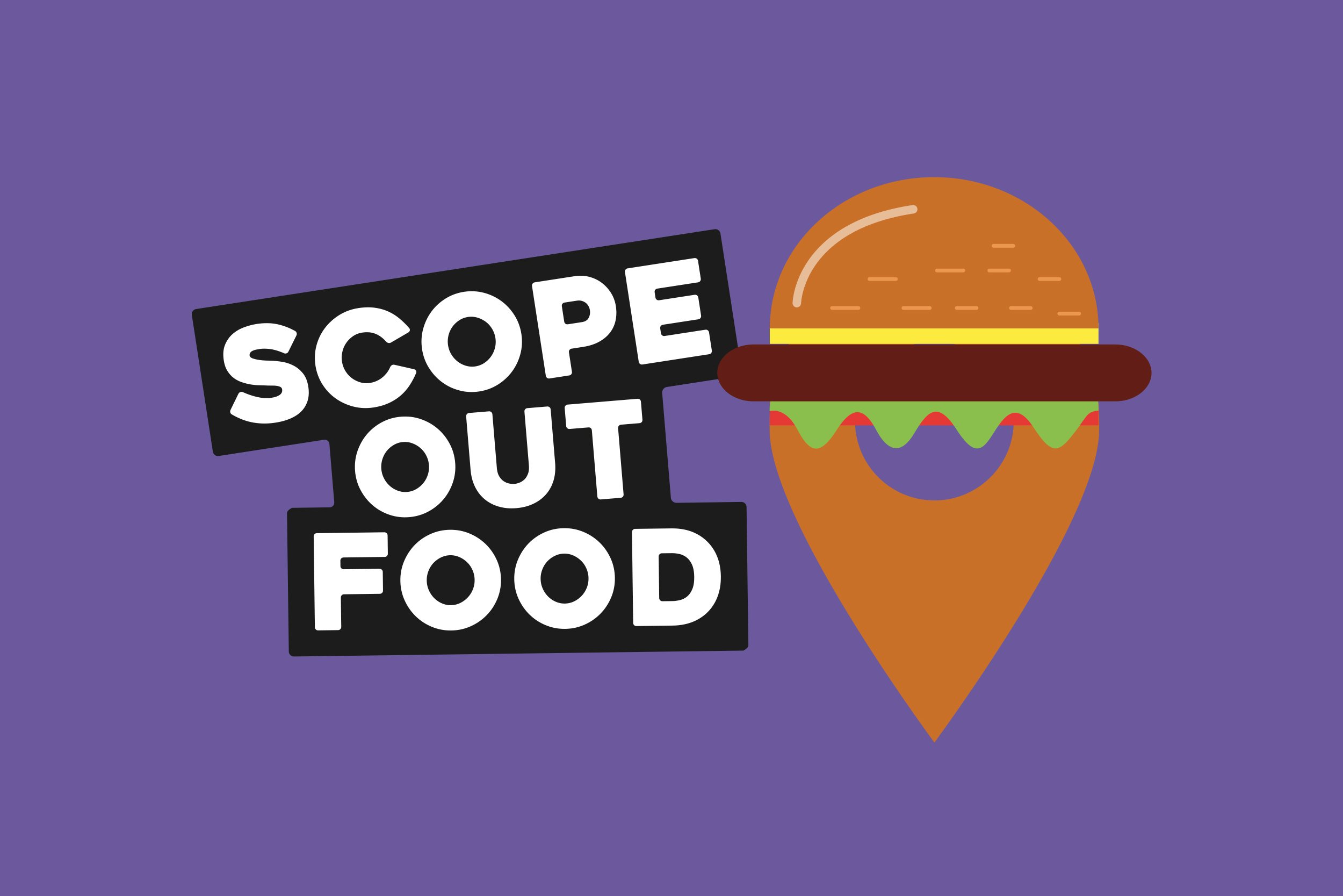
To add some fun and content icons to the brand, the location pin from the logo was adapted to create an icon for each category, such as a burger for places to eat, a bed for places to sleep and a cocktails for places to drink.
